Thursday, July 31, 2014

The Most Incredibly Affordable Outdoor Barn Lights!

I really wanted some chalky black outdoor barn lights for the back porch and around the rest of the house. I was going to have to order about ten lights, so paying $200 each or whatever was not going to happen!

 photo 31XFUCyqtpL.jpg

It looks like the price moves around a bit (I think shipping is free now), but I found these American Fluor Barn Lights on Amazon last month for only $35 each!! I was a little nervous they would look and feel cheap, but they are the real deal barn lights! Nothing fancy and built to last! Apparently you can get them at feed and tack stores for something like $25! I've heard Menard's has them for a similar price too.


 photo 3.jpg

The parts are incredibly well-made and beautiful. The inside of the shade is white porcelain and the outside is galvanized metal, so you'll probably want to paint the outside like I did, but it's super easy. I just put the shades face down on a drop cloth and sprayed the outsides with Rustoleum's flat black enamel. No tape necessary! I actually like that I wasn't paying for an exterior finish that I would have wanted to change anyway. The perfect base for a DIYer!

 photo 2.jpg

Do you have any favorite barn light sources? These were far and away the best deal I found, especially with such a large shade (14"!!).

 photo IMG_5747.jpg

Wednesday, July 30, 2014

Summer Reading List

I have two big trips coming up and I always like to have a couple of new books on hand before heading to the airport (which is exactly how you get an unruly book collection that looks like this). I will always end up buying my favorites, but I've started e-reading lately and I'm so happy with how convenient it is!


 photo ScreenShot2014-07-28at124316PM.png

Have you heard of Oyster? It's like Netflix for eBooks! For $9.95 a month you have access to unlimited books from their library of over 500,000 titles! Which means you can give up or put aside a book that's not quite right for you or for your mood and easily move on to another book. You can read on your iPad, iPhone, Android, Kindle Fire, Nook HD and computer.


They are offering a free 30-day trial subscription here and I started mine last week. I LOVE it. I'm totally hooked!


 photo ScreenShot2014-07-28at124500PM.png

Also, it's so silly how much I care about this sort of thing, but I really love that they give you a ton of different page and font options. I like the Penguin-style page above for day reading and the black background for easy-on-the-eyes night reading.

 photo ScreenShot2014-07-28at124445PM.png

One of my upcoming trips is to New York for work. I'll be staying in Brooklyn for most of the trip, which means some long subway rides. The great thing about Oyster is they let me keep TEN FULL BOOKS in my reader library at once - so no wifi, no problem! Can you tell I'm geeking out? 


We're all a bunch of book nerds over here, so I asked Kate and Heather to give me their summer reading lists to share too. Most of these are books we haven't read yet and we'd love your feedback if you have! 

Here's my list:


 photo Jenny.jpg

Beautiful Ruins - This one looks like a fun, light read. One complaint I've heard is there are too many characters and setting shifts, but I think that might make it an easy book to pop in and out of, in between sessions with my historical floor plans and Eggers (see below).


The Alchemist - Supposedly a very quick, sweet and simple read that leaves you thinking and inspired. I can get behind a book like that.


A Heartbreaking Work of Staggering Genius - I read, and loved, Dave Eggers' What is the What, but held off on this one because I've heard mixed reviews from friends - they either loved it or hated it. I think I'm ready to tackle it now though. Have you read this book?

Paris Mansions and Apartments, 1893 - I had heard this book was a good one and I flipped through it once in a book store and it looked amazing. Seems like a must for any one who gets a kick out of architecture, history and Paris. 

The Midwife of Venice - I was sick last winter and watched an episode of Call the Midwife on Netflix, desperate for distraction. I ended up watching two season's worth of episodes! Ha! I have no idea what this book is about, but it has good reviews and it's a period piece about a midwife, so I think my chances are good.

Once A Runner - I've heard this one described as the Bible of serious running. I am not a hardcore runner now, but I once was, and I truly loved it. Sometimes I read Marathon training books just for fun, so I think this one could be a winner for me.


Heather's List:

 photo Heather.jpg


The Cost of Lunch, Etc.I have a weakness for short stories, and I find myself being pulled to stories about women who are trying to wrestle with their inner demons. These stories look like they're going to deliver.

The Sisters BrothersConfession, while I have been seeing this book in several bookstores and the reviews seem very positive, the thing that makes me most curious to read it is that the author's last name is DeWitt. We're almost certainly not related, but I'm excited to see if it lives up to the family name ;) 

Telegraph AvenueMichael Chabon is, without a doubt, in the top tier of my favorite authors. I've read a few of his other books, so I've excited to read this one. I'm pretty confident that I'll like it. 

It Chooses YouMiranda July is one of the most brilliant artists of today! I love her movies, and I've read one or two of her short stories before, so I'm very excited to get more of her.

The Girl with the Golden EyesI've heard many great things about Balzac. I'm really looking forward to reading this book! 


Kate's List:

 photo Kate.jpg

Little BeeA few years ago it seemed like every book club was reading this, yet somehow I missed it. I started to read reviews and they are surprisingly vague because of a supposed pivotal plot twist and the reviewers "don't want to give too much away". I'm interested!

The Light Between OceansI cannot wait to read this book (it's next on my list!) I read a quick excerpt before putting it on my read list and it was so beautifully written that I'm finding myself rushing through my current book so I can start this one! 

The Collected Stories of Heinrich Boll"These diverse, psychologically rich, and morally profound stories explore the consequences of war on individuals and on an entire culture." This book jumped out at me and immediately went to my reading list, I'm a sucker for powerful short stories. 

The Geography of ThoughtI read this book back in a college psych class and it's interesting revelations have stayed with me for years so when I saw it on the list I knew I wanted to read it again. It's essentially a look into the differences between eastern and western culture- perception of time, healing, social interactions, medicine, and relationships.

The House of MirthMy sister has been telling me to read this book for years, turn of the century in New York and high society life, I'm wondering what took me so long. 

My AntoniaThis is the first book I recommend to people. It will forever remain a favorite of mine. Willa Cather writes so beautifully about the simplicity of friendship, and so strikingly about the potential of life. 

Extremely Loud and Incredibly CloseI read this book a few years ago and it's still one I think about often. Set around the heartbreak of 9/11, the narrator, a 9 year old, self-proclaimed pacifist, is a quirky, tambourine playing wise guy. This book is powerful, poignant, and emotional. 

The Man Who Would Be KingA collection on my reading list, short stories written by the winner of the Nobel Prize for literature. So I mean, it's gotta be good. 

_____


Alright friends, dish! What's on your summer reading list? Also, have you tried Oyster? Here's a list of their most popular titles.

This post was brought to you by Oyster Books. Don't forget to sign up for your free 30-day trial!! Thank you for supporting LGN sponsors!

Tuesday, July 29, 2014

Wallpaper on the Playroom Ceiling

The ceiling in the playroom is really low - just under eight feet. It actually feels nice and cozy, especially for the kids, but I wanted to try and trick the eye a little. I hung the yellow curtains almost up to the ceiling and that helped, but it felt like we needed something a little more exciting up on or by the ceiling.

 photo 26.jpg

I've always loved Julia Rothman's Daydream wallpaper from Hygge & West. In a middle-of-the-night design session I remembered the pattern and reached out the company to see if they had enough rolls in stock to send me a rush shipment. We were only a few days out from the Domino shoot at this point and I needed that paper ASAP!! Hygge & West was wonderful to work with and they rushed those couple of rolls out right away.

 photo 30.jpg

 photo 11.jpg


I went with the green color way, which has a creamy background, soft blue clouds and the prettiest color of jade green on the sweet little birdies. When the girls walked in after the paper hangers were finished, there were all sorts of oohs and ahhs and even some squeals. :) A very good sign. Gracie called it magical, which was pretty much the perfect compliment. I think it feels pretty magical too.

We finished out the edges with just some casing trim (no room for even a short crown) that we painted with left over paint from the bathroom ceiling (Farrow and Ball's Pale Powder). We matched the baseboards too and left the walls white (Benjamin Moore's Chantilly Lace).

 photo 31.jpg

The light fixture was a happy find at Lowes! It was a steal at $30!

 photo 28.jpg

 photo 29.jpg

The wallpaper was a relatively affordable way to quickly transform this space. I spent almost no money on anything else in the playroom, so I felt good about investing in the couple of rolls and the labor for the paper hangers. I did save a lot of money by prepping the walls myself. We skim coated every surface, including the ceiling, with hot mud and then primed it all. It was a ton of work, but it helped me feel better about hiring out the paper.  And really, we were so out of time, there was no way I could have hung this by myself. Plus it turns out there are all sorts of fancy contraptions the paper hanger used to install the long sheets at this angle. Tricky stuff! Sometimes it's best to leave installation to professionals - precious wallpaper is one of those times I think.

 photo 27.jpg

I couldn't be happier with this room. We use it all day long and it feels like such a happy, welcoming space where the girls can play and read and work on homework.

 photo 12.jpg

Monday, July 28, 2014

DIY Geometric Cube Painted Floor

For the longest time, I've had plans to paint a geometric cube pattern on an exterior floor. I really hoped to get to do it on our balcony porch in Brooklyn, but we moved before the weather gave me a good chance to patch the cracked concrete. When we moved to the Valley house I thought this little back porch area we have just off the kitchen and living room would be the perfect chance to scratch that itch!

 photo IMG_5747.jpg

I ended up going with a tumbling block tile in the bathroom, so I wanted this pattern to feel different. I saved this image a while back and it felt like the perfect inspiration - the proportions seemed easy enough to recreate (which, WRONG. Triangles, you kill me!) and it seemed like it wouldn't be too crazy on the eyes when painted on a large surface.

 photo MVML23.jpg

The first step was cleaning the concrete. We used a power wash sprayer to clean the old concrete and then we tried to not step on it before we got the first coat of water-based porch and floor paint down. I ended up watering down the paint because I wanted the finish to be a little mottled or translucent, so it almost, almost looked like a stain instead of paint. I mostly just didn't want the solid, flat look of a painted floor. Not that I was trying to age it, but I also didn't want the floor to look brand new and I think the watery paint helped get that look.

 photo IMG_5507.jpg

Then Kate and I worked to tape out the beginnings of the pattern. We knew we wanted the pattern to be on the larger side, so we made the main criss-cross pattern 12" wide.

 photo IMG_7447.jpg

Then it was time to put our heads together and do some serious math. I don't hate math at all, but I can't remember a lot of what I learned in trig and calculus, but luckily my smart husband has a memory like a steel trap and he busted out some formulas that helped us figure out the right angles. The most helpful measurement ended up being the hypotenuse (which was a little under 27 and 3/4"). Once we had that line measurement, we could back our way into the distance between the other angles and lines and it was easy to mark and then lay down the diagonal lines of tape.

 photo bIMG_7450.jpg

 photo IMG_7454.jpg

It felt a little tricky when we were in the thick of it, but it really wasn't all that bad. I think I was just nervous because I knew every measurement had to be spot-on perfect for the pattern to look right.

 photo bIMG_7481.jpg

 photo vIMG_7486.jpg

Somehow I can't find the photos of this part, but I divided the 27.71 hypotenuse number in half to figure out the dimensions of a diamond. I draw and cut out a diamond shape on poster board and used it like a stencil to trace out the smaller diamond in each of the larger diamonds. I also used a straight edge to make a line connecting the side point of the smaller diamond with the larger (you can see this in two photos down).

 photo IMG_7465.jpg

We watered down more porch and floor paint and filled in the shapes. We used Benjamin Moore's Titanium on the background, the white is Swiss Coffee, the yellow is Ochre and the darkest gray is Martha Stewart's Seal.

 photo IMG_7496.jpg

Kate and I have pretty steady painting hands, so I felt comfortable free-handing the lines, but it wouldn't have been too hard to tape off the small shapes one by one for perfectly perfect lines.

 photo IMG_5509.jpg

There were some spots that the tape pulled off the bottom layer of paint, but I think that had more to do with the concrete prep than the paint or the tape. I could have easily just touched up the lines and called it good, which we did to a little of, but we used a light hand there and even ended up lightly sanding the whole floor to take some of that new edge off. (again, that was a personal preference thing).

 photo 5.jpg

The result was just what I was hoping for. I know this floor is going to take a beating, so I didn't want it to look too precious from the get-go. We put two coats of porch sealer on top, and so far no big problems with scraping or flaking, even in this 115 degree heat! :)

 photo 9.jpg

 photo 2.jpg

I love seeing the pattern peek through the living room doors, and the girls love playing a crazy version of hopscotch on the pattern. We're excited for better weather too, when we can really start to enjoy the porch again and eat our meals outside. :)

 photo 1.jpg

Friday, July 25, 2014

Side Tables and Seating from Chairish

You guys were so nice about the side tables I designed. Thanks for all your kind words and encouragement to start selling them myself! Maybe that is down the road a bit. :)

 photo IMG_7884.jpg

I mentioned before that the side tables were inspired by these vintage Italian beauties from Chairish. I love these SO much and am jealous of the lucky person that snags them!

 photo Chairish8.png

This table has a similar vibe and is even more affordable. I love the stone top!

 photo Chairish7-1.png

Chairish is an amazing resource for really special pieces at affordable and very fair prices, especially when compared to sites that sell similar vintage goods! My favorite things to shop for on the site are chairs and side tables. They always have a really cool selection of super-unique vintage pieces. Here are some of my currently-available picks (and actually Chairish invited me to choose more than 30 favorites in a collection they featured here)! I'm sort of dying over those leather barstools...

 photo Chairish2.jpg


 photo Chairish6.jpg


 photo Chairish5.jpg


 photo Chairish7.jpg


 photo Chairish4.jpg


 photo Chairish3.jpg


 photo Chairish1.jpg


P.S. Don't forget that Chairish has a really fabulous app for iPhone users. It's a great and super easy way to list furniture to sell on Chairish, or just an easy way to shop on the go. I actually like to peruse the new listings in bed before I go to sleep. I'm guaranteed sweet dreams that way. :)

Chairish is a long-time sponsor of Little Green Notebook. Thank you for supporting our collaborators! :)

Thursday, July 24, 2014

New House Color!!

We just passed the one year mark here in Arizona. What a year it's been! There, for sure, have been some hard moments, and we miss parts of living in the city like crazy, but overall, we're so happy and grateful for this past year. Mostly, it has been 
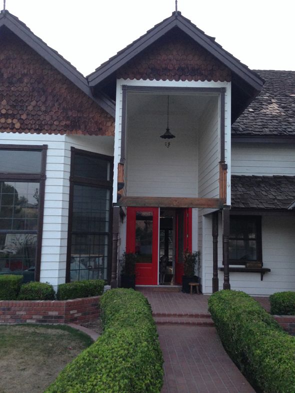
wonderful to live so close to family and of course I've loved getting to turn this house upside down! I can't believe how much has changed since last July. The exterior was the most recent big change and I'm so happy with how it turned out!

 photo 41.jpg

Benjamin Moore, a company I love and support whole-heartedly, saw that we were planning to paint our house and reached out about donating the paint. What an AMAZING help that was! The house needed a ton of prep work before the paint, and we made some big changes to the exterior structures with a contractor, so the labor alone ended up taking most of our exterior budget. Getting to work with Benjamin Moore on the paint was a dream come true! :) But I'll get to that in a minute. Here's the story of how the exterior of our house has changed this year, and a few plans for finishing up.

 photo 1DSC_0348.jpg

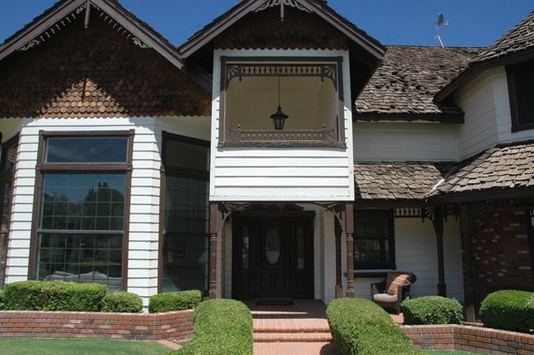
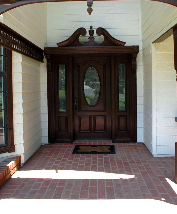
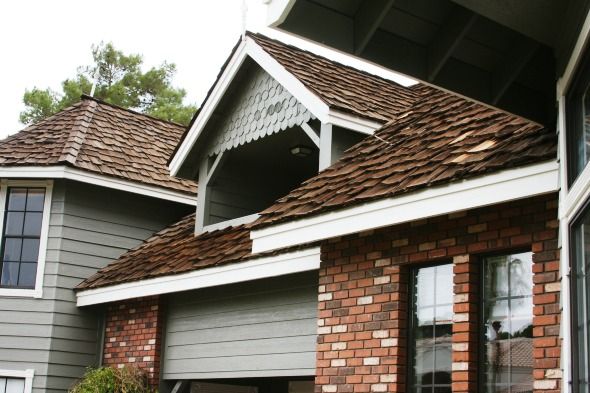
Remember when the house looked like this? Gingerbread everywhere. Cream body and brown trim. Black, scary sun shades on all the windows (which are helpful for keeping out the sun, but man, are they UGLY!).

 photo 1DSC_0350.jpg

 photo IMG_4572.jpg

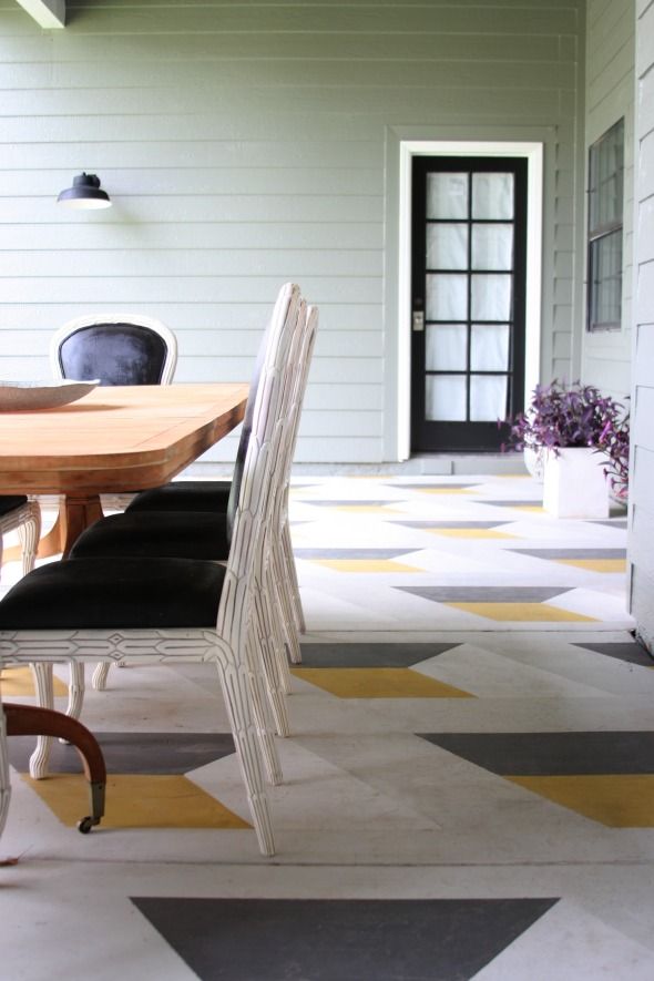
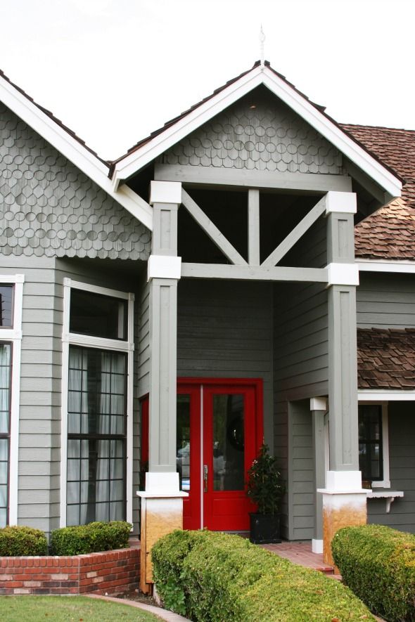
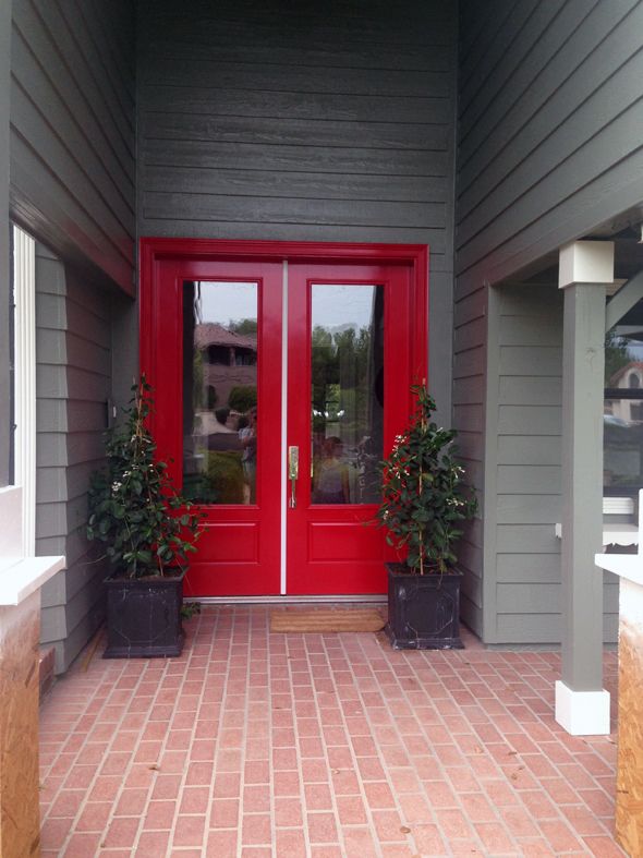
The first big project was changing out the front door. It's hard to show in pictures just how much of a transformation this was! The old door was only 80" tall, which felt so squatty with the tall vaulted entrance. Here's the post on changing out the door.

 photo 1DSC_0351.jpg

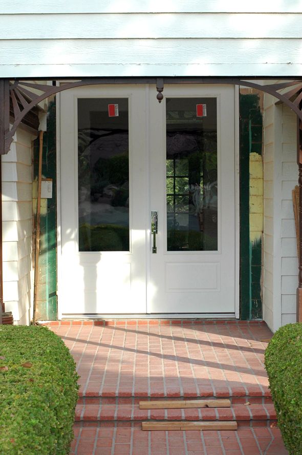
We chose a 9.5' tall double door. It fit the vertical space much better, but the door was blocked in the front by the weird front facade area.

 photo wDSC_0416.jpg

 photo aDSC_0425.jpg

My original thoughts were to just remove the front panel and open everything up all the way to the roof basically.

 photo wDSC_0420copy.jpg

But after we opened it up, the proportions felt so weird again! Too much was exposed, although, I was loving how much light was streaming in to the entry after getting rid of that partition piece!

 photo IMG_4879.jpg

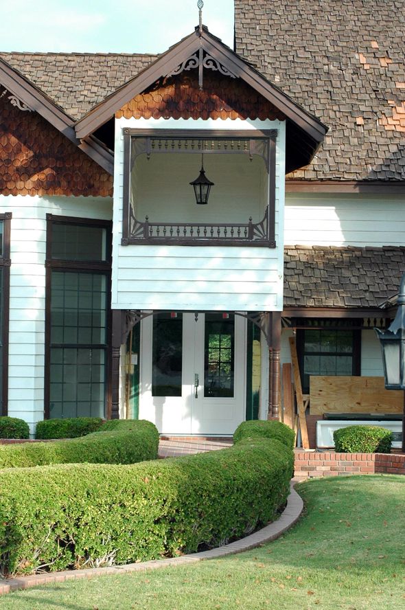
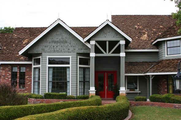
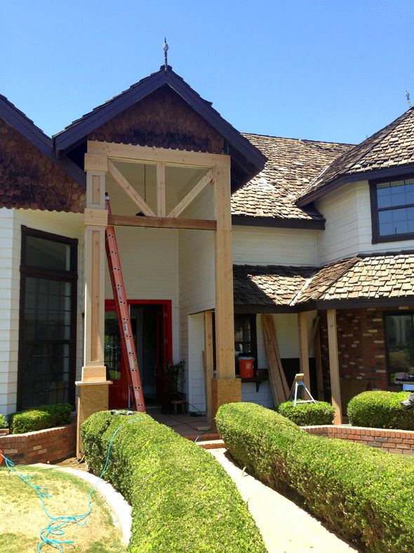
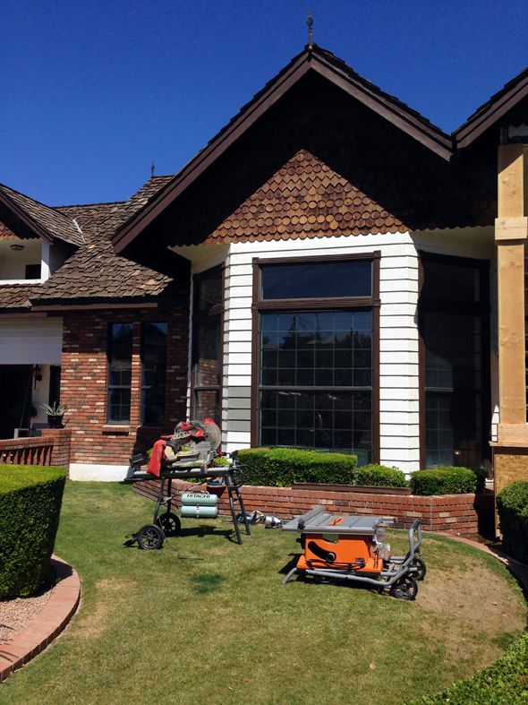
Our contractor was nervous about losing the cross beam altogether as well, even though it wasn't technically the load-bearing beam. So we came up with an idea to bump up the beam and add angled beams in too, which we would mimic all around the exterior of the house, where all the gingerbread used to be.

 photo IMG_4890.jpg

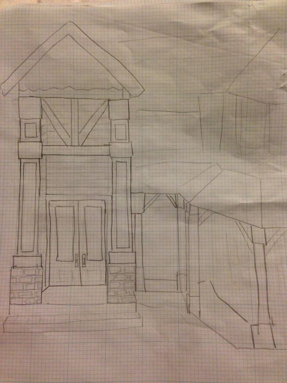
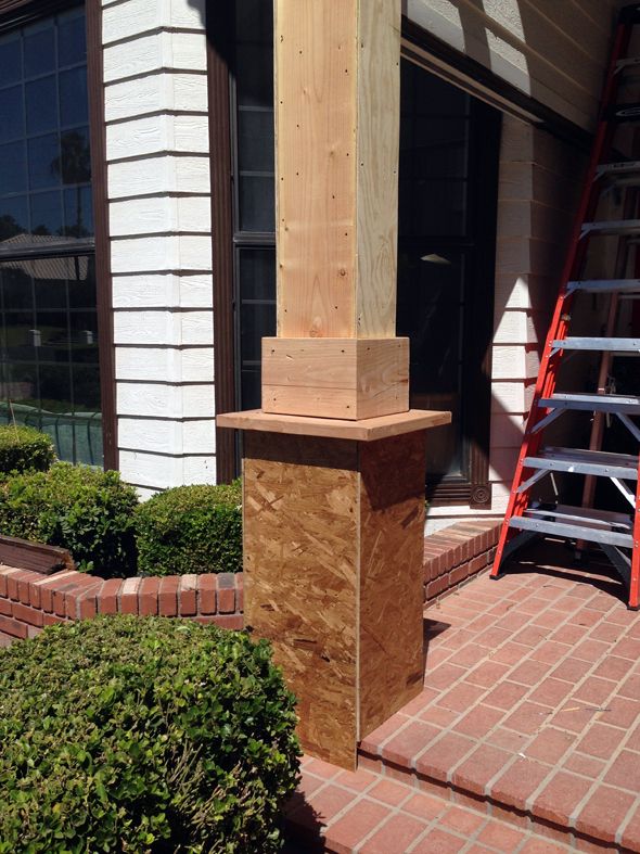
All the turned columns were replaced with chunky square beams and instantly everything felt more modern and more balanced.

 photo IMG_5064.jpg

 photo vIMG_5049.jpg

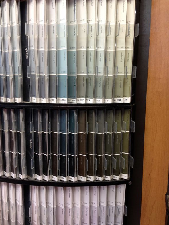
Once the exterior structural changes were almost done I went to my local Benjamin Moore store (Color Wheel on Stapley and Main) and looked at swatches for a good long while. I talked to them about different paint lines too and got their advice on that and finishes.

 photo IMG_7481.jpg

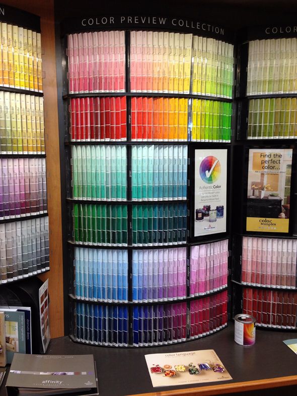
Benjamin Moore has so many wonderful colors it was tricky to pick a favorite for the house. I was drawn to the greeny grays the most and picked up a couple of chips and even a few sample pots to put up.
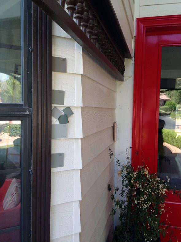
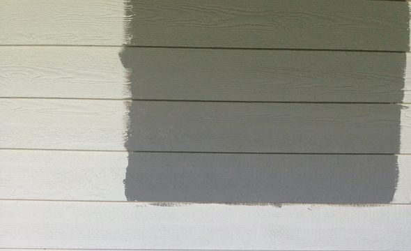
 photo IMG_7486.jpg

 photo IMG_4727.jpg

I put this photo up on Instagram for a reader vote. It seemed pretty split, which I expected. They're all great colors! (Top to bottom: Fieldstone, Desert Twilight, Rockport Gray)

 photo IMG_4764.jpg

I really tried hard to make it not be the name the put me over the edge, but 
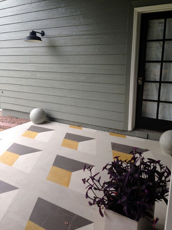
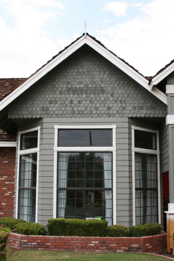
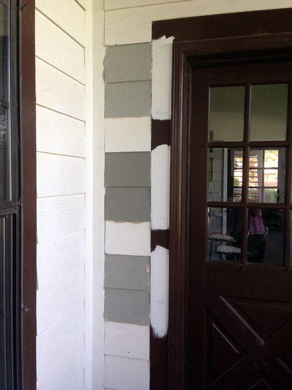
Desert Twilight (2137-40) was my favorite from the get-go. It was a little more green than I originally thought I'd want, but more and more I was in love with the shade and the idea of a greeny gray house. (Or at least I didn't want a color with very blue undertones and I felt like my other top choices swung more blue). I put up a big sample on the front and the back of the house, so we could see what Desert Twilight did at different times of day.

 photo zIMG_5257.jpg

 photo bIMG_5053.jpg

I was a little apprehensive to make the final call, but I knew I'd love the color, especially once all that icky brown color was gone.
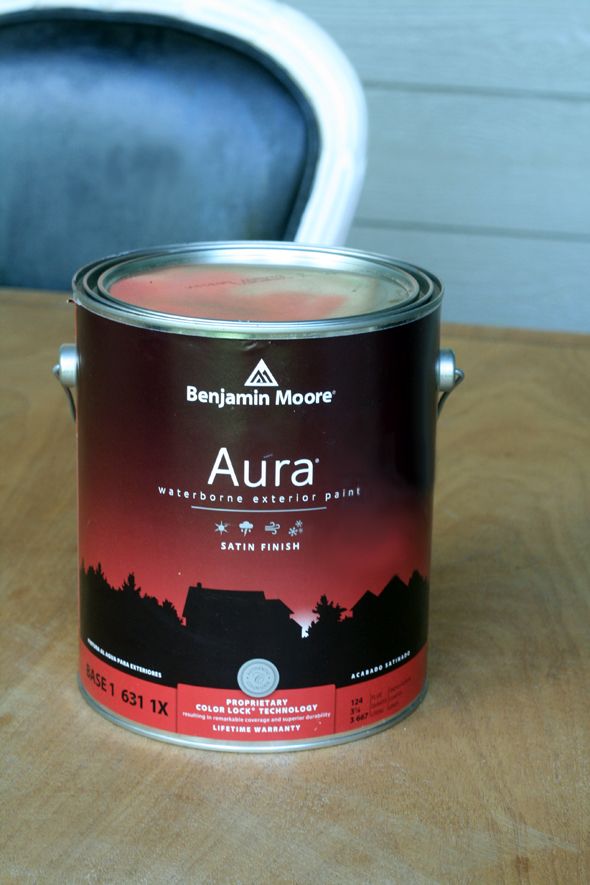
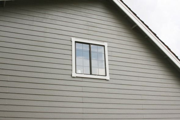
We chose to use the 
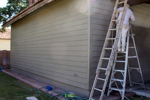
Aura exterior line in a Satin finish for both the body and the trim. My Benjamin Moore store said there's nothing like it on the market that resists color fading and paint deterioration as well, which were both problems we could see the house has had in the past. My wonderful team of painters (Eagle Painting) loved the product and commented multiple times about the quality of the paint. They were super impressed with the coverage.

 photo IMG_7990.jpg

It was an exciting day when the painters sprayed the first coat of Aura on the back of the house! So pretty! So dramatic!

 photo zIMG_7507.jpg

 photo IMG_7503.jpg

 photo IMG_5586.jpg

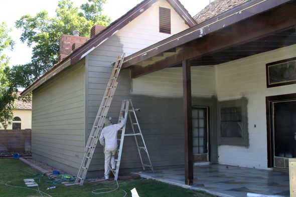
The Aura paint is actually self-priming, so we didn't need to use a primer on the back at all, but the front of the house gets a lot of full sun and there had been some damage from the elements. And since I wanted to paint out the weird shake shingles on the front of the house, the painters decided it would be a good idea to spray a coat of primer on the front. I knew the shake would never be a consistent, solid color the way that the siding looks, but I think the layer of primer helped even out the shake shingles. 

 photo IMG_5740.jpg

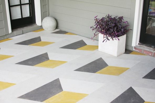
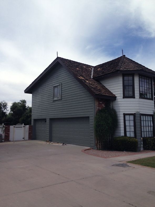
I think painting the shake out helped unify the choppy look of the house so much! I almost painted out the brick for the same reason, but I think I'm glad we kept the brick as-is for now. It was tricky to find a stopping point with the brick and I didn't want to paint the floors or the fencing.

 photo 47.jpg

We might figure out something to do with the brick down the road, but for now I think the new house color is in harmony with the tones of the brick. Such an improvement!

 photo 42.jpg

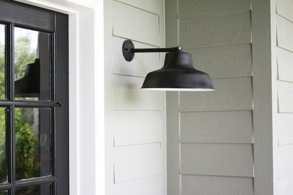
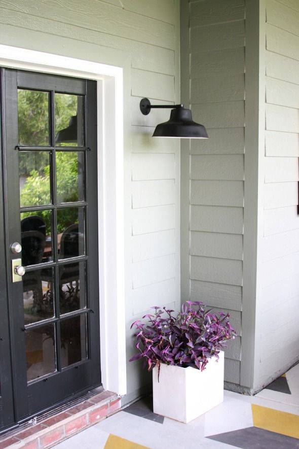
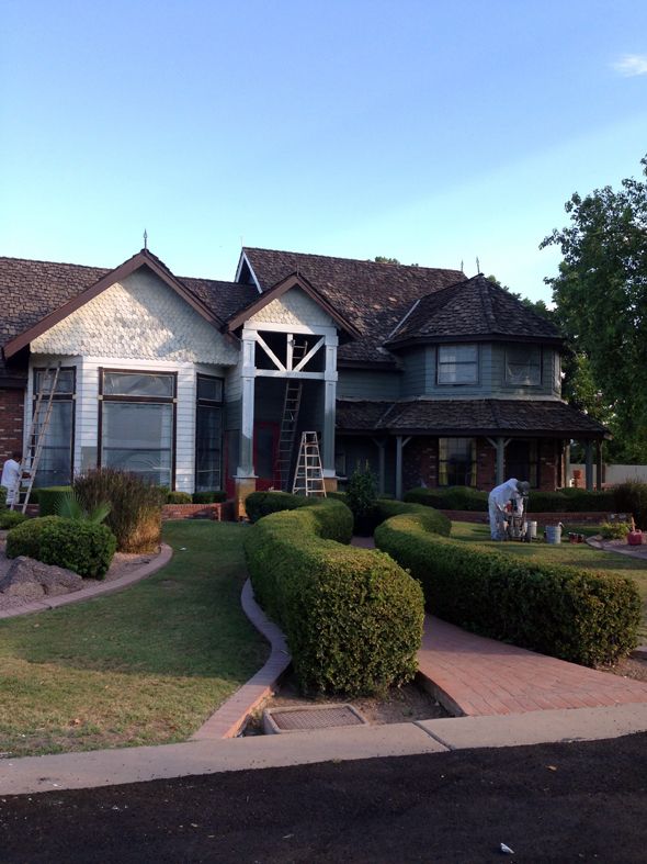
As soon as the white trim went on, I finally felt like I could catch my breath and let go of my worries about this project! It looked SO much more fresh with the dark trim gone!

 photo 44.jpg

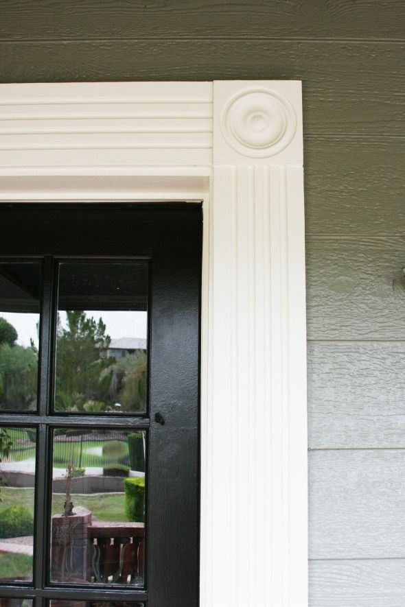
We chose White Dove (OC-17) for the trim and Onyx (2133-10) for the doors. All Aura, all satin.

 photo 48.jpg

We decided to keep the front door red in the end. I love how it looks against the Desert Twilight color! I was worried it would look Christmas-y, but it really doesn't. I actually think the red tones down the green a bit too.

 photo IMG_5818.jpg

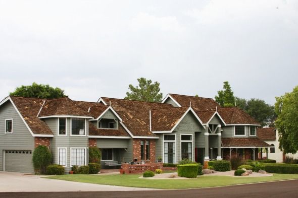
So, I'm sure you noticed, but we still have a way to go with the exterior of the house before we can call it good. We're saving our pennies right now so we can replace the roof next spring. It's expensive and not fun to spend that kind of money, but we've known about it and it is what it is. In the shorter term, we're going to have a mason come out and fix some of our broken bricks and then add matching brick to the bases of the two new columns flanking the front door. 

 photo 43.jpg

Looking down the road maybe a year or two, I'd like to change up the landscaping. Not sure with what, but something less twisty and curvy and fussy would be my preference. But truly, I am SO happy with all the changes we've accomplished in only a year's time! Every single one of our neighbors has stopped by to say how much they love it too and the validation feels great! :)

 photo IMG_4572.jpg

 photo 45.jpg

And OF COURSE, thank you, thank you, thank you to the wonderful people at Benjamin Moore, both local and corporate, for helping us to transform our home! We could not be more happy with the product or the outcome. :)

 photo 41.jpg